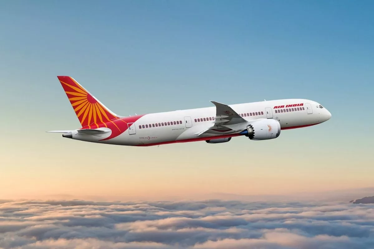
Air India
On Thursday, the airline Air India, which is owned by the Tata Group, is rebranded, and it unveiled its updated look. Air India kept the red, white, and a hint of purple as part of its logo. The Vista will be the name of the new logo. At the event, the airline also debuted its brand-new tail design and theme music. The logo, according to Chandrashekaran, Chairman of Tata Sons, represents confidence and boundless potential.
The new logo
“The new logo that you see here today… the vista signified by that historically used window (the peak of the golden window singnifies limitless possibilities, progress, confidence and all of it,” said Chandrasekaran.
“We are focusing on upgrading all human resource aspect… While we have ordered a large number of aircraft… We have to refurbish and get our current fleet in acceptable level… It is going to be a lot of hard work but the path is clear…We know where we want to be… The new logo represents our bold vision,” he added.
Also Read: SUSPENDED! Adhir Ranjan Chowdhury Deferred From Lok Sabha For ‘Unruly’ Conduct

“Our actions speak so much louder…” said Air India CEO
Air India CEO expressed himself on the event. He said, “Colours, patterns, shapes and how they come together and what they represent matter. But our actions speak so much louder. We are in the midst of a total transformation to reimagine the role of India’s flagship airline,”
He went on to say that the legendary “Maharaja,” who was Air India’s mascot for many years, would “live on” and “be part of the airline’s journey into the future.”
Air India is rebranded and has launched a new website offering…
In a press release issued on Thursday, the airline said, “The new look reimagines the iconic Indian window shape, historically used by Air India, into a gold window frame that becomes central to the new brand design system – symbolising a ‘Window of Possibilities’… Air India’s new logo symbol – ‘The Vista’ – is inspired by the peak of the gold window frame, signifying limitless possibilities, progressiveness, and the airline’s bold, confident outlook for the future.”
” The Airline is making significant investments throughout the guest experience to elevate its service and to strengthening its position as the preferred airline for travellers flying to, from, and within India,” the airline’s release said.
“Air India has launched a new website and mobile app, offering a significantly improved web experience with new digital tools and features,” it added.
The airline had stated that an event on August 10 would mark the beginning of a new age of transformation. Since 2014, Air India has utilised a crimson swan with an orange depiction of the Konark Chakra as their logo. The airline announced that it would obtain a new livery with purple, red, and white accents. While Air India’s colours are red and white, Vistara’s livery is used for the purple.
To read more such news, download Bharat Express news apps